In the previous post of this series, we covered an overview of the Ordinary Least Squares method for estimating the parameters of a linear regression model. While I didn’t give you a full tour of the mathematical guts underpinning the technique, I’ve hopefully given you a sense of the problem the model is attempting to solve, as well as some specific vocabulary that describes the contents of a linear regression. In this post, we’re going to continue working with the {palmerpenguins} data, but we’ll actually cover the task of fitting a model in R, and inspecting the results. Some of what we’ll cover is basic R, but we’ll also use a handful of functions from {broom}, which is a really handy package for wrangling information out of the objects that R creates to store linear models.
building a model with lm()
We’ll start by loading the {tidyverse} and {palmerpenguins} packages, given that we’ll be using contents from both within this post. Then, we’ll return to our scatterplot, but this time I’m going to have R plot the regression line between the two variables we’re interested in. Using ggplot, it’s straightforward to add this line using geom_smooth(). Inside this geom function, I’ve set the method argument to “lm,” which tells R to fit a line to the data identified within aes() using the lm() function.
library(tidyverse)
library(palmerpenguins)

ggplot(data = penguins, aes(x = flipper_length_mm, y = bill_length_mm)) +
  geom_point() +
  geom_smooth(method = "lm") +
  labs(x = "Flipper Length (mm)", y = "Bill Length (mm)")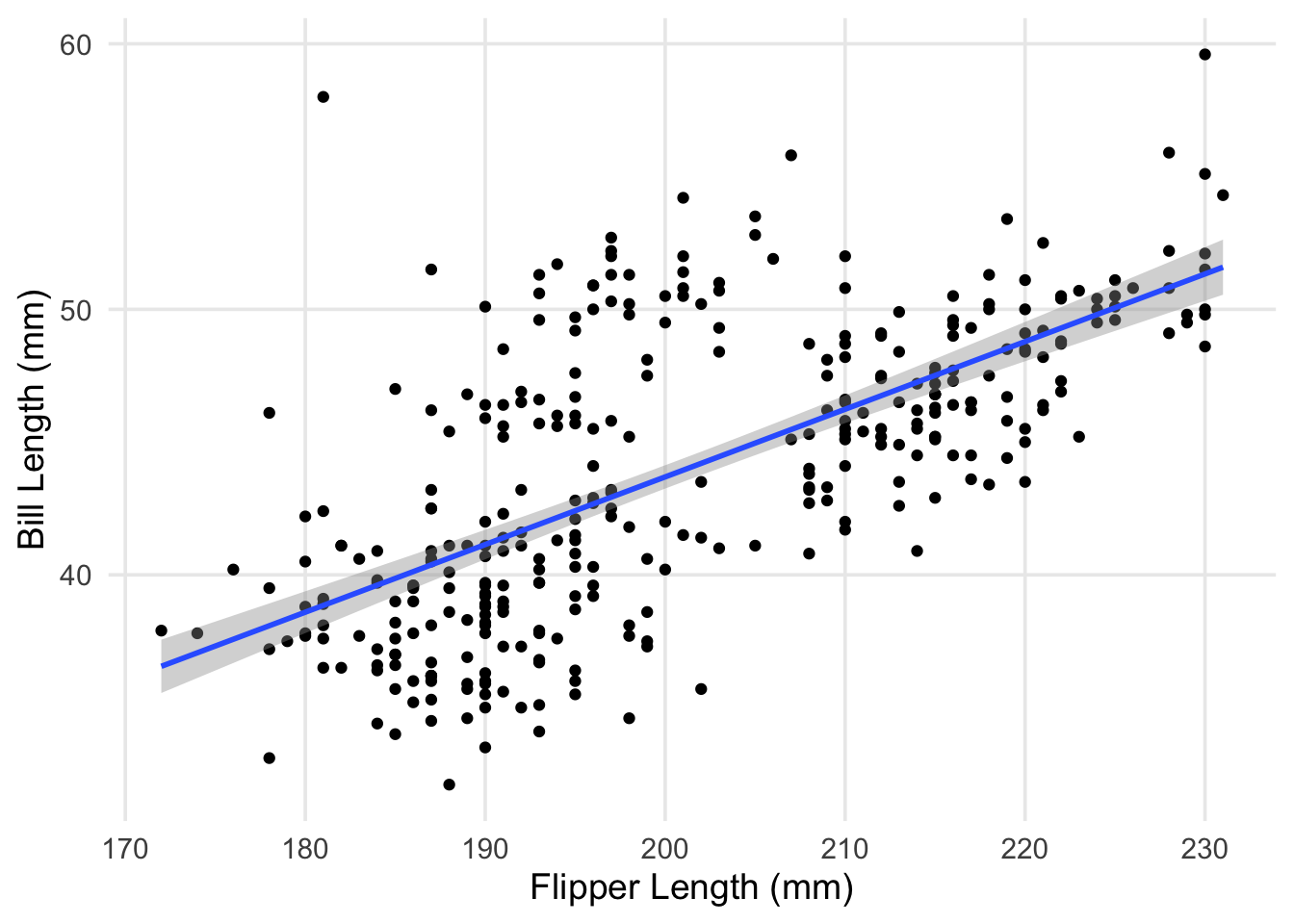
As a small recap from last time, what we’ve just plotted is the line that minimizes the total (summed) squared errors between each point and the line. Now that we’ve visualized our data and the model we’re using to summarize it, let’s try using the lm() function itself.
fit <- lm(formula = bill_length_mm ~ flipper_length_mm, data = penguins)These commands aren’t super lengthy, but let’s look carefully at each component. Inside lm(), I’ve specified two arguments: formula, and data. The latter is hopefully self-explanatory; the lm() function needs to know where to find the data that we want to analyze. In this case, I’ve passed it the same data.frame we’ve been using up to now. On the other hand, the formula argument is where we define the relationships we want to model. In R, we do this by writing out an equation, using the language’s “formula” notation. It might be helpful to think of the ~ in an R formula as sort-of like an equals sign. In the command above, we set our outcome as bill_length_mm, which is to the left of the tilde. On the right-hand side, we have our predictor, flipper_length_mm. R then uses what’s specified in the formula to fit the model, looking in the data for the variable names referenced in the equation. That’s it! We’ve built our first model– now it’s time to take a look at the results.
In R, you can often get information from an object just by printing it. For results produced by lm(), the output is fairly minimal– just the formula and data used, along with the parameter estimates.
# just printing the object
fit
##
## Call:
## lm(formula = bill_length_mm ~ flipper_length_mm, data = penguins)
##
## Coefficients:
## (Intercept) flipper_length_mm
## -7.2649 0.2548It’s more common to use the summary() function, which produces much more detailed information about the contents/results of our model. We’ll discuss each component in the next few sections.
# more detailed
summary(fit)
##
## Call:
## lm(formula = bill_length_mm ~ flipper_length_mm, data = penguins)
##
## Residuals:
## Min 1Q Median 3Q Max
## -8.5792 -2.6715 -0.5721 2.0148 19.1518
##
## Coefficients:
## Estimate Std. Error t value Pr(>|t|)
## (Intercept) -7.26487 3.20016 -2.27 0.0238 *
## flipper_length_mm 0.25477 0.01589 16.03 <2e-16 ***
## ---
## Signif. codes: 0 '***' 0.001 '**' 0.01 '*' 0.05 '.' 0.1 ' ' 1
##
## Residual standard error: 4.126 on 340 degrees of freedom
## (2 observations deleted due to missingness)
## Multiple R-squared: 0.4306, Adjusted R-squared: 0.4289
## F-statistic: 257.1 on 1 and 340 DF, p-value: < 2.2e-16residuals
At the top of what comes out of summary() when used on an lm object is a description of the range and distribution of the model’s residuals. Residuals are a really important concept in regression– they’re one of the primary ways we’re able to investigate how well our model fits the data we’re analyzing. In the last post, we actually learned a bit about them, but I didn’t identify them by name.
To more clearly define them, a residual is the difference between each of our penguin’s observed bill-length, and the predicted (fitted) bill-length that’s generated by the model. To revisit a plot I used in the last post, with updated values for \(\beta_0\) and \(\beta_1\), our model’s predicted value for each point is the rising blue line (our regression line). The residuals for each point are the vertical orange segments that measure the distance between each point and the regression line.
ggplot(penguins, aes(x = flipper_length_mm, y = bill_length_mm)) +
  geom_segment(aes(y = (-7.26487 + 0.25477 * flipper_length_mm), yend = bill_length_mm, x = flipper_length_mm, xend = flipper_length_mm), color = "orange") +
  geom_abline(intercept = -7.26487, slope = 0.25477, color = "blue") +
  geom_point() +
  labs(x = "Flipper Length (mm)", y = "Bill Length (mm)")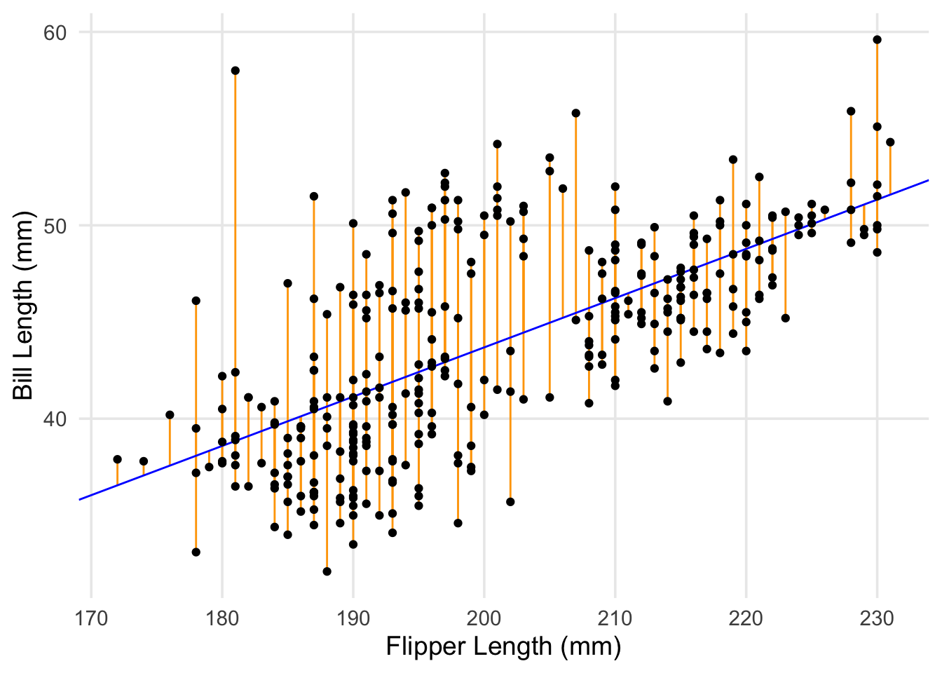
One of the primary ways we can use residuals to check how well our model peforms is by creating diagnostic plots. Here I’m going to use the augment() function from the {broom} package. You pass augment() a model object (often those created by lm or glm), and it generates a new data frame with the predicted/fitted values from the model, as well as residuals.1 You can either calculate these things on your own, or pull fitted values & residuals out of model objects using fitted() and resid(), but using the broom function simplifies things a bit, given that data frames are the standard currency for ggplots.
library(broom)

# create a data frame with variables used in model + residuals & fitted/predicted values, among other info
aug_fit <- augment(fit)

# don't miss the periods in front of .fitted and .resid!
ggplot(aug_fit, aes(x = .fitted, y = .resid)) +
  geom_hline(yintercept = 0, lty = "dashed") +
  geom_point() +
  labs(
    x = "Fitted (Predicted) Values", y = "Residuals",
    title = "Fitted vs. Residual Plot"
  )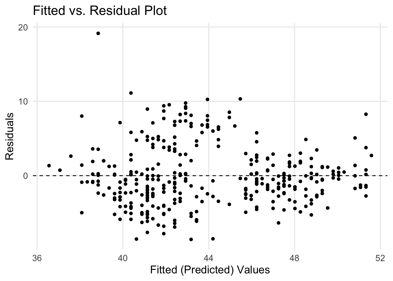
The above plot is a more traditional way of looking at residuals vs. predicted values. We’ve basically taken our regression line and laid it flat horizontally. In this approach, you can scan across the range of predicted values, checking how each point differs from 0. This style of plot is helpful to examine if one of the classical assumptions for linear regression is met: whether the residuals have a stable variance across the range of predicted values. Just by eye-balling our plot, it feels sketchy to assert that the spread of points is the same across the whole range– in particular, it seems like there’s a difference in points that have predicted values between 40 and 44 vs. elsewhere.
What about the sizes of the differences? If our data was strongly linear, all the points would be really close to 0, but is this about what we would expect if our model was fitting the data well? Are the residuals roughly equally distributed above and below the regression line? This leads us towards another common diagnostic plot, a simple histogram of the residuals. Here we have a frequency distribution for all of our data points, and we can visually check if the residuals have a normal distribution (or approximately normal, being mound shaped & roughly symmetric). If the residuals don’t exhibit this characteristic, it can be another sign that the relationship being modeled isn’t well-represented by a line. In our case, it’s not a perfectly bell-shaped curve, but it’s passable.
ggplot(aug_fit, aes(x = .resid)) +
  geom_histogram(color = "white")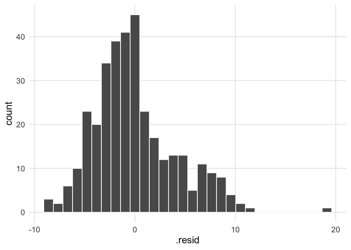
coefficients
Now we’ll move on to the next chunk of output, the model coefficients, in this case \(\hat{\beta_0}\) and \(\hat{\beta_1}\). Here I’m going to use the tidy() function from {broom} to represent this information cleanly as a data frame (tibble). Each variable in the model is placed under the term column, and the coefficient estimates are reported under estimate. In the last post we spent a lot of time talking about how the betas are estimated, and now that we have them, we can talk about the other information that accompanies them.
tidy(fit)## # A tibble: 2 x 5
## term estimate std.error statistic p.value
## <chr> <dbl> <dbl> <dbl> <dbl>
## 1 (Intercept) -7.26 3.20 -2.27 2.38e- 2
## 2 flipper_length_mm 0.255 0.0159 16.0 1.74e-43The 3rd column, std.error is the standard error of the coefficients (sometimes abbreviated “SE”). These represent the level of uncertainty we have for each estimate. Gelman and Hill (2006) suggests that roughly speaking, “estimates within 2 standard errors of \(\hat{\beta}\) are consistent with the data” (p.40).2 Applying this heuristic to our table, this means that our intercept could be within [-13.7, -0.9] and the coefficient for flipper length could range from [-0.1, 0.6]. Gelman and Hill (2006) also provide a rule of thumb that coefficients >2 SE from 0 can be considered “statistically significant” (although, it’s worth emphasizing as they do, that this is not the same as being “practically significant”). Aside from special cases in which two (or more) predictors that are highly correlated with each other are each included in the same model, standard errors should decrease as a function of sample size.3 Thus, assuming your data is representative of the population you’re studying, the parameters/coefficients of the model will become more precise as more data is accumulated.
The last two columns, statistic and p.value are tricky to talk about, and I hope to convince you that they’re less interesting than the \(\beta\)s and SEs. Although practices are changing, there are sometimes impressions that p-values for model coefficients can be seen as markers of statistical (if not scientific) importance. The story of how this impression gained prominence is complex, and in a future post I might explore a narrow set of reasons for why it’s misguided. For our purposes I hope I can briefly outline what information they do provide. In a single sentence, they’re simply summarizing a ratio of the \(\beta\)s and SEs. This ratio is called a t-statistic, and when using linear regression, is computed for each coefficient using the following formula:
In our case, the t-statistic for flipper length would be 0.255 / 0.0159 = 16.03 – which lines up with what’s reported in our output above. Statistical theory tells us that this value should come from a t-distribution, which can tell us the probability of getting a value as large as, say 16.03, assuming that the expected value was 0. What we can conclude practically here, is that the likelihood of seeing a value of this size under our degrees-of-freedom is really small, and we have some evidence against the assertion that the coefficient is equal to 0. But that’s all we’re learning here; we’re just being told that the slope probably isn’t flat. It’s also worth noting that this is where sample-size becomes relevant for what a significant t-statistic can tell you. As I noted above, SE should decrease as more data is collected. This means that as SE approaches zero, even very small \(\beta\)s have a chance to generate a t-statistic that’s associated with a very small p-value.
overall indices of fit
Okay! We made it to the last section on regression output! 🎉 🎉 🎉 🎉
In this post, we started very zoomed in, looking at differences between predicted vs. actual points, and now we’re finishing with some big-picture aspects of the model overall. We’re going to use another {broom} function, called glance() to pull out this information. Like the tidy() function, glance() also produces a data frame for us to work with.
glance(fit)## # A tibble: 1 x 12
## r.squared adj.r.squared sigma statistic p.value df logLik AIC BIC
## <dbl> <dbl> <dbl> <dbl> <dbl> <dbl> <dbl> <dbl> <dbl>
## 1 0.431 0.429 4.13 257. 1.74e-43 1 -969. 1944. 1955.
## # … with 3 more variables: deviance <dbl>, df.residual <int>, nobs <int>The first columns returned are r.squared and adj.r.squared; next to p-values, an \(R^2\) (“R-squared”) value is probably one of the most recognizable terms for anyone learning about linear regression. Also referred to as the coefficient of determination, the \(R^2\) measures the proportion of the outcome’s variance explained by the model, and ranges from 0 to 1. More specifically, it is defined as \(R^2 = 1 - \hat{\sigma}^2 / s^2_y\), where \(\hat{\sigma}^2\) (“sigma squared”) is the unexplained variance of the model, and \(s^2_y\) is the variance of the outcome. However, it’s more common in practice to prefer the adjusted R-squared, which accounts for the number of predictors that are included in the model. This is because \(R^2\)s generally go up as an analyst adds more & more variables to a model, and thus it’s sensible to adjust for this fact.
This leads us into discussing the next column, sigma, also known as residual standard deviation4 and often symbolized by \(\hat{\sigma}\). Again referring to Gelman and Hill (2006) (emphasis mine), “we can think of this standard deviation as a measure of the average distance each observation falls from its prediction from the model” (p.41). This is a useful way of succinctly summarizing the accuracy of the model’s predictions. In our case, our predictions are off by an average of 4.1mm. Perhaps there’s room for improvement!
The next two columns, statistic and p.value, report the results of the model’s F-test, or omnibus test. I don’t want to spend much time on these two, so in brief, the results of this test summarize a comparison between a null model (i.e. a model with just an intercept, and no predictors) versus the fitted model you specified. A large F-statistic and small p-value will occur when at least one of your predictors is better at explaining the outcome than the null model. Phrased differently, this result indicates whether your proposed model is better at predicting the outcome better than just the outcome’s mean. The reason I don’t find this test very useful is that if you look at the estimated coefficients and see any predictor that’s likely different from 0 (i.e. the \(\hat{\beta}\) isn’t super close to 0, and its standard error is small), you already have the same information the F-test would provide.
Okay, last few columns from glance():
df.residualanddf- In regression analysis, the degrees of freedom is calculated as \(n - k\), where \(n\) is the number of observations, and \(k\) is the number of estimated coefficients (including the intercept). In the output from
glance(), this information is reported in thedf.residualcolumn. The other column,dfreports \(k\), but omits the intercept (it can be read as the number of predictors in your model).
- In regression analysis, the degrees of freedom is calculated as \(n - k\), where \(n\) is the number of observations, and \(k\) is the number of estimated coefficients (including the intercept). In the output from
logLik,AIC,BIC- I’m not going to go in-depth on the output of these columns in this post. Each of these quantities are hard to interpret because their scales aren’t really meaningful in isolation. The
deviancecolumn also falls into this category. They become more valuable in the context of model comparison, i.e. when you have multiple sets of predictors, and have specific hypotheses about whether model “A” is better for explaining the outcome compared to model “B.”
- I’m not going to go in-depth on the output of these columns in this post. Each of these quantities are hard to interpret because their scales aren’t really meaningful in isolation. The
nobs- This is just the # of observations that were included in your final model. That’s all! Note that R will exclude observations from the results if they have missing data for any of the variables (outcome or predictor) included in the model formula.
okay, (mostly?) done with new terminology
Up to now, we’ve covered the following:
- How to plot a regression line using ggplot and
geom_smooth(), and how to fit a basic model usinglm() - Discussed residuals conceptually, and introduced a few common diagnostic plots
- In relation to this topic, we discussed two assumptions underlying linear regression: a) stable variance in the residuals across the range of fitted values, and b) the distribution of residuals should be normal (or at least, approximately normal).
- Covered how to extract output from a regression model in R, using
tidy()andglance().- Here we also talked about the standard error of model coefficients, as well as the overall residual standard deviation, which are important for understanding the uncertainty about the different estimates produced during the analysis.
At this point, I think we’re mostly done with introducing significant concepts and terminology. We’ve worked through most of the components and pieces that comprise a linear regression analysis and the standard kinds of output that R provides. In what I believe will be the final post, we’ll turn to the topic of multiple linear regression (i.e., linear regressions that feature more than 1 predictor), and focus a bit more closely on how to interpret the estimated coefficients.
references
You can also give
augment()a new dataset with observations you want predictions for. As long as all the variables used by the model are in your new dataset, you just need to use the equivalent ofaugment(fit, newdata = my_new_data).↩︎As Gelman and Hill note, this is a bit of a short-cut but they indicate its generally fine to use if the degrees-of-freedom in the model are >30. In the context of linear regression, degrees of freedom can be found by calculating \(n - k\), where \(n\) is the number of observations in your data, and \(k\) is the number of parameters being estimated.↩︎
Honestly, might need a citation here– my recollection is that this can be one of the problems caused by collinearity, and that when variables that correlate strongly (\(r \geq 0.5?\)) are included in the same model, both the coefficient estimates can be affected, as well as the standard errors for the affected variables.↩︎
Ideally this won’t be distracting, but I want to note that what R labels as “residual standard error” in the output of
summary()is actually residual standard deviation. I found this initially confusing in terms of trying to understand what I was learning about in textbooks etc. versus what I was being given in my output by R. The help documentation for?sigmaexplains that this is a quirk of an old misnaming that pre-dates R and existed in its predecessor (the S language). Hopefully this saves you a headache in the long-term!↩︎